Friday, 27 December 2013

Contents Page Drafts


This was the contents page that I decided I wanted the basis of mine to look like. This was because it was exactly what I was looking for in the ways that it's unique in the way that it looks unlike the majority of most magazines contents pages.


These are the first two drafts for my contents page, so far I like how they look and I'm sure they're going to look a lot better when the picture is added. For my contents page I had to make sure that I was using the same sort of scheme that I used for the front cover of the magazine. Like the contents page above I will be using a picture that was taken at a concert that I recently went to, which I hope goes along with the whole scheme of the magazine and fits in with the layout of the contents page.

Magazine Cover Final Design

 This is my magazine final design. I was going to make this simple as it's supposed to be a special edition magazine cover, but in the end I decided against that as it just made the cover look plain and uninteresting.
For this design I tried to make the masthead noticeable and stand out, I did this by using the bevel and emboss effect on InDesign which made the font rounded and slightly 3D. I did this as I wanted it to be the thing that makes the magazine recognisble. When it came to the colours, I stayed with the normal red, black and white which are the colours that are usually used on this sort of magazine. I also decided to go with a cracked sort of writing for the masthead so that it went along with the name of the magazine, I also used this throughout the magazine as I decided to make this a theme through the whole of the magazine.

Magazine Cover Drafts (Part 2)


These are a few screen shots I took throughout the process of making my magazine cover. As I was going along I changed many aspects of the design so that nothing looked out of place and everything went together nicely. I was going for the rock/metal sort of magazine; kind of like Kerrang! and Rock Sound. So, to make it look anything like a magazine within that genre, I had to make sure I was using themes and conventions that would instantly make any viewer know what the genre of the magazine is. In the end I decided I wanted to make my magazine cover rather simplistic, and with the main cover line of the magazine being official rock chart, I thought the idea suited well.


Flat Plans

Magazine Cover 


This was the first flat-plan for my magazine, but as I was putting the magazine together all of my ideas changed mainly so it went along with the main image I was using. I decided to make the cover rather plain and simplistic as I wanted my magazine to be a special edition; dedicated to one thing.

Contents Page


For my contents page I decided I wanted to use one that already existed for the basis of my idea; so I used a rather unique looking 'Rock Sound' contents page. I liked this contents page as it was unlike most contents pages you see in the average magazine, with it's interesting format and this is exactly what I was looking for.


Thursday, 28 November 2013

Magazine Cover Drafts (Part 1)

Draft 1 


To make this cover better, I need to make everything look more interesting. I also need to add more 'rocky' themes so that the cover would appeal to the target audience that I am aiming for. To make the cover more interesting there would also have to be an image of some sort which goes along with the main cover line.

Draft 2


I then decided to make it so the font was slanted slightly to make the page more aesthetically pleasing and interesting to look at. This was when I decided to change the name of the main featured band from 'Your Place Or Mine' to 'Murder Parade' as it sounds more interesting and is more of a realistic band name.

Monday, 25 November 2013

Proposal

My magazine is specifically aimed towards people from the ages of 13 - 25. This is because the type of magazine I am planning to make seems to appeal more to this age range of people. I decided to aim for people within this age range as I intend for my magazine to be slightly like Kerrang! which is mainly aimed at teenagers and young adults.
The image I intend to put on the cover of my magazine is of just a single person, who I intent to look like a lead singer of a band. To get this image I will take a photo shoot with one of my friends and ask them to stand in variation of different poses. I'll also ask them to dress up in an alternative type fashion in order for the images to go along with the genre of my magazine. Once I've taken as many pictures as needed I'll just pick the pictures that came out the best and go along with the ideal magazine cover I'm looking for.
The genre of magazine I am aiming for is Rock, sort of like Kerrang! or Rock Sound. This is because in my survey these two magazines were the most well known, followed closely by NME which is a magazine that talks about a mixture of genres.
My magazine will be a special edition magazine, dedicated mainly towards to 'Rock 100 chart' but will also have a number of other special content like exclusive interviews and inside information into band members lives and so on. I will make sure that the main cover line on the magazine front cover stands out, this is so that people will be drawn to the magazine and be curious to see what place their favourite band has come, as well as what position other bands they may like have come, therefore making them want to buy the magazine.
The typical content that will be within the rest of the magazine would be mainly the 'Rock 100' charts but also things like; new albums coming out; rising stars; upcoming concerts; following bands on tour; exclusive interviews; gig guides; live reviews ... etc.
On the cover there is going to be the main cover line, which will be the main feature of the magazine and will take up a fair few pages. There will also be a few other cover lines which let people know some of the other articles that are present throughout the magazine, this would appeal to people who aren't interested in the main feature of the magazine.
For my masthead, I want it to stand out and be recognisable, but also something that fits in with the genre of magazine I have chosen. For example, something like: 'CRASH!' would work, especially if I select a typeface that is broken and cracked, as well as picking a bright colour, therefore making the masthead stand out, which in turn would make the magazine cover eye-catching and aesthetically pleasing.
I would make it so my magazine was a monthly edition, this is so that it would be up to date with the Rock/Metal industry, with this being the case I would make it so the colour scheme of the magazine changed depending on the season as well as things that happen within that month like, Halloween and Christmas.
I would make my magazine be the same dimensions as the average magazine: 8.5 x 11.
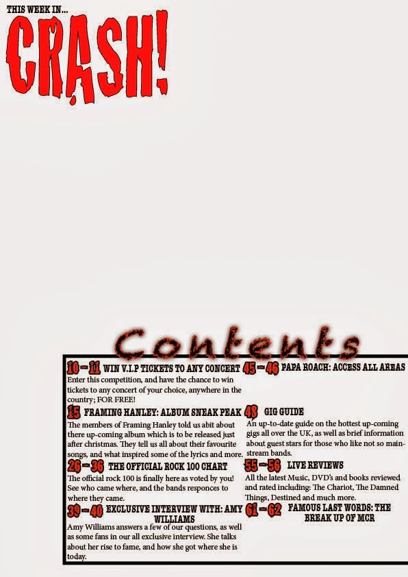
On the contents page I would use one single image with the contents being within a reasonable sized back on the right hand side of the page. I am planning to do this as I am aiming for my contents page to be unique and unlike the ordinary layout of a contents page.
My magazine would be sold for £2.99, this is so the it's within the price range of the target audience.

Initial Ideas

 First Ideas
I am aiming my magazine towards teenagers and young adults, as well as people that are interested in Rock/Metal music. The image I expect to put on the front cover of my magazine is of one person who of which I would portray as a lead singer of a band.
I have decided that I am going to make my magazine a rock/metal magazine, slightly like the likes of Kerrang! and Rock Sound, with the same sort of contents and target audience. 
I'm planning to make the front page stand out and instantly be recognised as a rock/metal magazine just from the conventions and the layout of the page, I'm also going to make it so the masthead is bright and bold so that it stands out and therefore makes the magazine eye-catching as well as aesthetically pleasing.
I want to make it so that my contents page is rather diverse and unlike most contents pages, this is because I am planning for the magazine to be the same as any ordinary magazine but unique at the same time. 

Friday, 22 November 2013

Survey Results


Question 1


Question 2

Question 3


The last question I asked was: 


 What would a music magazine front cover need for it to catch your eye, and make you want to read more?


Here are a few of the responses:

  • It would need to have an interesting main image, and a catchy and interesting main cover line.
  • A picture of a popular band/singer.
  • Colour, Bold lettering,short snappy headings
  • For a music magazine front cover to catch my eye and make me want to read more, it would have to have a bold, easily recognisable masthead. The main cover line of the magazine would have to be something that would be interesting and appeal to a wide audience. The cover would also have an interesting main image which relates to the main cover line.
  • Something like the rolling stone magazine, with an artist on the front, with smaller headlines around the image
The results for the survey helped me decide which genre of magazine would be better to do and why. For this questionnaire to have got better results, I would have had to ask more and better questions. I would also have to have asked more people, as the results are rather biased for the fact that they're mainly answered by people within the same age range.