Friday, 27 December 2013

Contents Page Drafts


This was the contents page that I decided I wanted the basis of mine to look like. This was because it was exactly what I was looking for in the ways that it's unique in the way that it looks unlike the majority of most magazines contents pages.


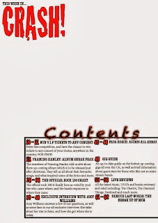
These are the first two drafts for my contents page, so far I like how they look and I'm sure they're going to look a lot better when the picture is added. For my contents page I had to make sure that I was using the same sort of scheme that I used for the front cover of the magazine. Like the contents page above I will be using a picture that was taken at a concert that I recently went to, which I hope goes along with the whole scheme of the magazine and fits in with the layout of the contents page.

Magazine Cover Final Design

 This is my magazine final design. I was going to make this simple as it's supposed to be a special edition magazine cover, but in the end I decided against that as it just made the cover look plain and uninteresting.
For this design I tried to make the masthead noticeable and stand out, I did this by using the bevel and emboss effect on InDesign which made the font rounded and slightly 3D. I did this as I wanted it to be the thing that makes the magazine recognisble. When it came to the colours, I stayed with the normal red, black and white which are the colours that are usually used on this sort of magazine. I also decided to go with a cracked sort of writing for the masthead so that it went along with the name of the magazine, I also used this throughout the magazine as I decided to make this a theme through the whole of the magazine.

Magazine Cover Drafts (Part 2)


These are a few screen shots I took throughout the process of making my magazine cover. As I was going along I changed many aspects of the design so that nothing looked out of place and everything went together nicely. I was going for the rock/metal sort of magazine; kind of like Kerrang! and Rock Sound. So, to make it look anything like a magazine within that genre, I had to make sure I was using themes and conventions that would instantly make any viewer know what the genre of the magazine is. In the end I decided I wanted to make my magazine cover rather simplistic, and with the main cover line of the magazine being official rock chart, I thought the idea suited well.


Flat Plans

Magazine Cover 


This was the first flat-plan for my magazine, but as I was putting the magazine together all of my ideas changed mainly so it went along with the main image I was using. I decided to make the cover rather plain and simplistic as I wanted my magazine to be a special edition; dedicated to one thing.

Contents Page


For my contents page I decided I wanted to use one that already existed for the basis of my idea; so I used a rather unique looking 'Rock Sound' contents page. I liked this contents page as it was unlike most contents pages you see in the average magazine, with it's interesting format and this is exactly what I was looking for.